Apartheid ideology:
It all started
when the Dutch east India Company founded a colony at the Cape of Good Hope in
1652. The Dutch settlers were called Afrikaans or Boers ("farmers").
They took away the land from the native Africans and made them work on the
farms as slaves.
In 1795 the Cape was captured by the British during the
French Revolutionary Wars. The Dutch settlers were uneasy living under British
rule especially after the British government made all slaves free throughout
the British Empire in 1838. So the Boers moved northward and set up their own
independent republics of Transvaal and Orange Free State (1835-40). During the Anglo
Boer War (1899-1902) the British defeated these states and the Union of South
Africa was formed in 1910. (M Martin. In
the name of apartheid, 1988)
Apartheid was a
system implemented by the national party in 1949 that aimed to maximise white
power and that practically legalised racialism and this lasted for over 40
years with the support of the United States and other world powers. In this
system blacks were separated from the whites, they were forced into homelands
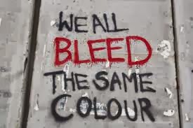
and were not allowed to vote. Apartheid was a gross violation of human rights;
it stripped blacks of their dignity and god given free will.
Racial
inequalities was evident long before the National Party came into power, it was
however not law. As a result of these injustices the Youth League of the ANC
was formed to fight against them in 1944. It is in this forum that Nelson
Mandela became a key figure in the fight against apartheid.
When the
National Party came into power in 1949 one of their first policies was the
abolishment of marriages between mixed races. The following they introduced the
group areas act, this act moved blacks into townships far away from city
centres and blacks were not allowed to be in the city without a 72 hour letter
of permission. The national party followed up with even more radical policies,
such as the immorality act, which prohibited any sexual activities between
different races, people found guilty of disobeying this act faced harsh prison
time, other acts included the implementation of Bantu education, the
abolishment of communist parties and the initiative that blacks had to carry a
pass all the time, if found without face severe consequences.
In 1960 the
National Party, threatened by the ANC, declared the party illegal. In 1962
Nelson Mandela and a number of his comrades were arrested and sentenced to life
in Robin Island. After mounting pressure from overseas and crippling sanctions,
South Africa begins to lessen its grip on apartheid under the leadership of FW
De Klerk.
Eventually in a
historic moment Nelson Mandela was released from prison in 1990 and began
negotiation with De Klerk s cabinet.
Mandela and De Klerk were awarded a noble prize for their peace efforts.
1994 saw South Africa’s first democratic elections and the nation first black president.
Although all South Africans celebrate democracy every year, it cannot be denied
that the end of the apartheid system in South Africa left the country
socio-economically divided by race.

Year: 1950
For: A road sign in Johannesburg, Population Registration Act, Act No 30
This photograph
shows a sign demarcating an area for whites only and forbidding blacks. The
system of apartheid was enforced by a series of laws passed in the 1950s: the
Group Areas Act of 1950 assigned races to different residential and business
sections in urban areas, and the Land Acts of 1954 and 1955 restricted
non-white residence to specific areas. (Finnegan, 1986).
This was an
example of the separate amenities act implemented by the National party, which
separated public facilities racially. This photograph clearly illustrated that this
area is for whites only but black people can also be seen in these areas. Black
people are likely to be seen here maybe because these areas the majority who work
in the farms is blacks. This road signs warns the white people to be careful.
The word “caution” and the word “natives” has flashing lights added to them in
order to highlights the ‘beware’ the danger if you are not careful of these
people. Under apartheid, the black majority was mostly poor,
whilst the small white minority that held power was conspicuously rich. African
townships were demolished and their occupants removed to new townships well
beyond city limits. In order to get they daily bread black people were forced
to walk long mails thought areas with dehumanising signs such as this to get to
the appointed cheap labour at the farms or mines.
Blacks who
broke order on these signs were punished severely; no matter the emergency
breaking the law was completely forbidden.
These types of
signs were seen all over the country. Shopping centres, parks, toilets, beaches
and all other public places.
The poster
itself is quite eye-catching because of the contrast created between the bright
greys and the black and white used in the photographs. This propaganda poster
is slightly different from other propaganda posters of war era mainly because
it makes use of actual photographs instead of illustrations. This photograph is
effective because it portrays a real picture of human mortality, forcing the
viewer to experience emotion.
Apartheid
Resistance and Revolution
The South Africa Act takes away all
political rights of Blacks Africans in three of the country’s four states. The
Native Land Act of 1913 gives 7% of the country’s land to Black Africans, who
make up 80% of the population. Black Africans are prohibited from owning land
outside their region. They are allowed to be on white land only if they are
working for whites. Blacks are fired from jobs which are given to whites. The
representation of the Voters Act in 1936 weakens the political rights for Black
Africans in some regions and allows them to vote only for white
representatives. By 1939 fewer than 30% of Blacks are receiving any formal
education, and whites are earning over five times as much as Blacks. New legislation classified South Africans into racial
groups of "black, white, colored, and Indian”, the government segregated education, medical care, beaches, and other public services, and provided black
people with services inferior to those of white people.
Apartheid showed a significant internal resistance and violence during and after the 1950s, popular uprisings and protests
were met with the banning of opposition and imprisoning of anti-apartheid
leaders. As the conflict spread and became more violent, state organizations
responded with increasing repression and state-sponsored violence
A new phase of the South African revolution
has opened with the formation of COSATU and the success of the mighty May Day
strike which it called. One and a half million black workers struck, tens of
thousands attended rallies and demonstrations in defiance of the repression. In
the townships, the youth have shown themselves undaunted by the savage
onslaught that the armies of police and the state-backed ’vigilantes’ have
unleashed against them.
In South Africa, the resistance to the apartheid wasn’t violent as
it was in France. The African National Congress (ANC) was led by Nelson
Mandela, and “spearheaded resistance” to the apartheid. They had a “policy of
non-violent, civil disobedience” and every protest was peaceful. (F E. Smith, 2011)
Visuals:


South African flag, coat of arms and currency

The new arms were introduced on Freedom Day, 27 April 2000. The change reflected government's aim to highlight the democratic change in South Africa and a new sense of patriotism.
The Coat of Arms is a series of elements organised in distinct symmetric egg-like or oval shapes placed on top of one another. The completed structure of the Coat of Arms combines the lower and higher oval shape in a symbol of infinity. The path that connects the lower edge of the scroll, through the lines of the tusks, with the horizon above and the sun rising at the top, forms the shape of the cosmic egg from which the secretary bird rises. In the symbolic sense, this is the implied rebirth of the spirit of the great and heroic nation of South Africa.
The Coat of Arms is also a central part of the Seal of the Republic, traditionally considered to be the highest emblem of the State. Absolute authority is given to every document with an impression of the Seal of the Republic on it, as this means that it has been approved by the President of South Africa. Since 1997, however, the use of the Seal of the Republic has not actually been required by the Constitution, but it continues to be used.
The motto's green is extended by pairs of elephant tusks. Within it are two ears of wheat and a golden shield with Khoisan rock art of two greeting human figures from the Linton stone. Above the shield is a crossed knobkierie and spear, protea, secretary bird, and a rising sun.
The Oval Shape of Foundation
The first element is the motto, in a green semicircle. Completing the semicircle are two symmetrically placed pairs of elephant tusks pointing upwards. Within the oval shape formed by the tusks are two symmetrical ears of wheat, that in turn frame a centrally placed gold shield.
The shape of the shield makes reference to the drum, and contains two human figures from Khoisan rock art. The figures are depicted facing one another in greeting and in unity.
Above the shield are a spear and a knobkierie, crossed in a single unit. These elements are arranged harmoniously to give focus to the shield and complete the lower oval shape of foundation.
The Motto: The motto is: !ke e: /xarra //ke, written in the Khoisan language of the /Xam people, literally meaning "diverse people unite". It addresses each individual effort to harness the unity between thought and action. On a collective scale it calls for the nation to unite in a common sense of belonging and national pride - unity in diversity.
The Ears of Wheat: An emblem of fertility, it also symbolises the idea of germination, growth and the feasible development of any potential. It relates to the nourishment of the people and signifies :the agricultural aspects of the Earth.
Elephant Tusks: Elephants symbolise wisdom, strength, moderation and eternity.
The Shield: It has a dual function as a vehicle for the display of identity and of spiritual defence. It contains the primary symbol of our nation.
The Human Figures: The figures are derived from images on the Linton stone, a world-famous example of South African rock art, now housed and displayed in the South African Museum in Cape Town. The Khoisan, the oldest known inhabitants of our land and most probably of the Earth, testify to our common humanity and heritage as South Africans and as humanity in :general. The figures are depicted in an attitude of greeting, symbolising unity. This also represents the beginning of the individual’s transformation into the greater sense of : belonging to the nation and by extension, collective humanity.
The Spear and Knobkierie: Dual symbols of defence and authority, they in turn represent the powerful legs of the secretary bird. The spear and knobkierie are lying down, symbolising peace.
The Oval Shape of Ascendance
Immediately above the oval shape of foundation, is the visual centre of the Coat of Arms, a protea. The petals of the protea are rendered in a triangular pattern reminiscent of the crafts of Africa.
The secretary bird is placed above the protea and the flower forms the chest of the bird. The secretary bird stands with its wings uplifted in a regal and uprising gesture. The distinctive head feathers of the secretary bird crown a strong and vigilant head. The rising sun above the horizon is placed between the wings of the secretary bird and completes the oval shape of ascendance.
The combination of the upper and lower oval shapes intersect to form an unbroken infinite course, and the great harmony between the basic elements result in a dynamic, elegant and thoroughly distinctive design. Yet it clearly retains the stability, gravity and immediacy that a Coat of Arms demands.
The Protea: The protea is an emblem of the beauty of our land and the flowering of our potential as a nation in pursuit of the African Renaissance. The protea symbolises the holistic :integration of forces that grow from the Earth and are nurtured from above. The most popular colours of Africa have been assigned to the protea – green, gold, red and black.
The Secretary Bird: The secretary bird is characterised in flight, the natural consequence of growth and speed. It is the equivalent of the lion on Earth. A powerful bird whose legs - depicted as the :spear and knobkierie - serve it well in its hunt for snakes, symbolising protection of the nation against its enemies. It is a messenger of the heavens and conducts its grace upon :the Earth. In this sense it is a symbol of divine majesty. Its uplifted wings are an emblem of the ascendance of our nation, while simultaneously offering us its protection. It is depicted in gold, which clearly symbolises its association with the sun and the highest power.
The Rising Sun: An emblem of brightness, splendour and the supreme principle of the nature of energy, it symbolises the promise of rebirth, the active faculties of reflection, knowledge, good judgement and willpower. It is the symbol of the source of life, of light and the ultimate wholeness of humanity.
National Flag

The central design of the flag, beginning at the flagpost in a "V" form and flowing into a single horizontal band to the outer edge of the fly, can be interpreted as the convergence of diverse elements within South African society, taking the road ahead in unity. The theme of convergence and unity ties in with the motto "Unity is Strength" of the previous South African Coat of Arms.
Did you know that:
the flag must be treated with respect at all times and must not:
- Touch the floor or ground.
- Be used as a tablecloth or be draped in front of a platform.
- Be used to cover a statue, plaque or cornerstone at ceremonies,
- Be used to start or finish tournaments.
and, that:
- When the National Flag is displayed with any other flag, it must be hoisted up first and lowered last?
- When our own flag is displayed with flags of other countries, all of them should be of equal size and flown at same height.
- When used or displayed next to, or behind, a speaker at a meeting, it must be on her or his right-hand side. And when placed, elsewhere in the hall or meeting place, it should be to the right of the audience.
- When displayed vertically against a wall, the red band should be to the left of the spectator with the hoist or the cord seam uppermost.
- And that, if displayed horizontally, the hoist should be to the left of the spectator and the red band uppermost.
The National Bird
Blue Crane
Anthropoides paradiseus

The National Animal
Springbok
Antidorcas marsupialis

National Fish
Galjoen (Coracinus capensis)

 National Flower
Giant or King Protea (Protea cynaroides)
The Giant or King Protea is widely distributed in the south-western and southern areas of the Western Cape, from the Cederberg up to just east of Grahamstown. The artichoke-like appearance of the flower-heads of the King Protea lead to the specific name 'cynaroides', which means 'like cynara' (the artichoke). The name does not do justice to the beautiful flower-heads of this protea, which is the largest in the genus. A number of varieties in colour and leaf shapes are found, but the most spectacular is the pink coloured flower.
National Tree
Real Yellowwood (Podocarpus latifolius)

South African Currency
Introduced on February 14 the year 1961, the South African currency has the symbol “R’ which stands for the Rand. In addition, the South African currency is the medium of exchange in Swaziland, Lesotho and South Africa itself. These three countries form the common monetary area. However, some countries with the likes of Namibia have legalized the South African currency. Before the rand was made the legal South African currency, the South African pound was the legal tender. This had been introduced by Britain but as soon as the Republic of South Africa came into being, the current South African currency was introduced. The exchange rate at the time of independence was 2rands for 1pound but as the years passed, apartheid caused the South African currency to depreciate.

Transition of bank notes
With the introduction of the South African currency in 1961, came bank notes of different denominations. The first banknotes were of: 1, 2, 10 and 20 rands. Their outlook was similar to the South African pound and bore the portrait of Jan van Riebeeck. In addition, they were printed in English and Afrikaans a trend that continued until 1966 when notes were printed introducing the 5 rand note and doing away with the 20 rand note. This was also the time that also saw the 1 rand note being replaced by a coin. The transition of the South African bank note continued over the years and most recently a major change occurred when on February 2012 President Jacob Zuma announced that the government would issue out new look bank notes. The same year (2012), the new bank notes were ready for circulation. They came in denominations of: 10, 20, 50, 100 and 200 rand.
With the introduction of the South African currency in 1961, came bank notes of different denominations. The first banknotes were of: 1, 2, 10 and 20 rands. Their outlook was similar to the South African pound and bore the portrait of Jan van Riebeeck. In addition, they were printed in English and Afrikaans a trend that continued until 1966 when notes were printed introducing the 5 rand note and doing away with the 20 rand note. This was also the time that also saw the 1 rand note being replaced by a coin. The transition of the South African bank note continued over the years and most recently a major change occurred when on February 2012 President Jacob Zuma announced that the government would issue out new look bank notes. The same year (2012), the new bank notes were ready for circulation. They came in denominations of: 10, 20, 50, 100 and 200 rand.
 Coins denomination
At the same time that the bank notes were introduced in 1961, so were the coins. These coins came in denominations of: , 1, 2, 5, 10, 20 and 50 cents. In 1989 the 2- rand coin was introduced followed by the introduction of the 5-rand coin in 1994. The 1 and 2- cent coins stopped circulating in 2002 though they are still acceptable to date. In August 2004, the new 5-rand coin was introduced and security measures put into place to ensure originality.
The South African rand performs exceptionally well both in forex and stock reports. Over the years, the South African currency has continued to stand out and has led to most if not all countries accepting the rand into their markets. This factor has made the South African currency grow steadily a move that has seen its stability against the major currencies. As much as the South African currency has gained world wide recognition, South Africa’s economy has steadily grown as many investors want to deal with the current rates the South African currency is offering in the international markets.
The South African currency is printed in a way that brings a sense of belonging to the South African nationals. The front side bears the portrait of South Africa’s hero Nelson Mandela who has acquired world wide recognition for his fight against apartheid. This has brought South Africa to the spot light. The eleven major languages have also been incorporated in the printing of different denominations. South Africa as a tourist destination has the big five wild animals printed at the back of their various denominations.
Not only does the South African currency provide a good medium of exchange, it is also a good way of publicizing and making Africa proud. This explains why three countries have decided to use the South African currency as their legal tender. Indeed, it makes South Africa to be a country that plays a very critical role in shaping the economy of the African continent.
http://www.safariafrica.co.za/tourist-information/south-africa.htm
http://buzzsouthafrica.com/south-african-currency/
Galjoen. 1972. Standard Encyclopaedia of Southern Africa, vol 5, p107.VAN DER ELST, R., A Guide to The Common Sea Fishes of Southern Africa. 1981. Cape Town: C Struik Publishers.
BROWNELL, F.G., Nasionale en Provinsiale Simbole. 1993. Johannesburg: Chris van Rensburg Publications.
NEWMAN, K., Birdlife in Southern Africa. 1971.
http://www.sahistory.org.za/brief-history-drum


